正在加载图片...
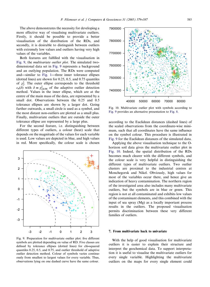
P.Filzmoser et al.Computers Geosciences 31 (2005)579-587 585 The above demonstrates the necessity for developing a 7900000 more effective way of visualising multivariate outliers. Firstly,it should be possible to provide a better visualisation of the distribution of the RDs,and 7800000 secondly,it is desirable to distinguish between outliers with extremely low values and outliers having very high values of the variables. 7700000 Both features are fulfilled with the visualisation in Fig.9,the multivariate outlier plot.The simulated two- dimensional data set in Fig.9 represents a background 7600000 and an outlying population.The RDs were computed and-similar to Fig.1-three inner tolerance ellipses (dotted lines)are shown for 0.25,0.5,and 0.75 quantiles 7500000 of 7.The outer ellipse corresponds to the threshold cn()with 6=720.9s of the adaptive outlier detection method.Values in the inner ellipse,which are at the 7400000 centre of the main mass of the data,are represented by a small dot.Observations between the 0.25 and 0.5 40000 50000 60000 70000 80000 tolerance ellipses are shown by a larger dot.Going further outwards,a small circle is used as a symbol,and Fig.10.Multivariate outlier plot with symbols according to the most distant non-outliers are plotted as a small plus. Fig.9 provides an alternative presentation to Fig.8. Finally,multivariate outliers that are outside the outer tolerance ellipse are represented by a large plus. according to the Euclidean distances (dashed lines)of For the second feature,i.e.distinguishing between the scaled observations from the coordinate-wise mini- different types of outliers,a colour (heat)scale that mum,such that all coordinates have the same influence depends on the magnitude of the values for each variable on the symbol colour.This procedure is illustrated in is used.Low values are depicted in blue,and high values Fig.9 for the Euclidean distances of the simulated data. in red.More specifically,the colour scale is chosen Applying the above visualisation technique to the O- horizon soil data gives the multivariate outlier plot in Fig.10.Indeed,the spatial distribution of the RDs becomes much clearer with the different symbols,and the colour scale is very helpful in distinguishing the different types of multivariate outliers.Two outlier clusters are proximal to the industrial centres at Monchegorsk and Nikel.Obviously,high values for most of the variables occur there,and hence give an indication of heavy contamination.The northern region of the investigated area also includes many multivariate outliers,but the symbols are in blue or green.This region is not at all contaminated and exhibits low values of the contaminant elements,and this combined with the input of sea spray (Mg)as a locally important process results in the outliers.The proposed visualisation permits discrimination between these very different families of outliers. -3 2 1 01 2 7.From multivariate back to univariate Fig.9.Preparation for multivariate outlier plot:five different With the help of good visualisation for multivariate symbols are plotted depending on value of RD.Five classes are defined by tolerance ellipses (dotted lines)for chi-squared outliers it is easier to explain their structure and quantiles 0.25,0.5,and 0.75,and outlier threshold of adaptive interpret the geochemical data.To support interpreta- outlier detection method.Colour of symbols varies continu- tion it is useful to visualise the multivariate outliers for ously from smallest to largest values for every variable.Thus. every single variable.Highlighting the multivariate observations lying on one dashed curve have the same colour. outliers on the maps for every single element couldThe above demonstrates the necessity for developinga more effective way of visualisingmultivariate outliers. Firstly, it should be possible to provide a better visualisation of the distribution of the RDs, and secondly, it is desirable to distinguish between outliers with extremely low values and outliers havingvery high values of the variables. Both features are fulfilled with the visualisation in Fig. 9, the multivariate outlier plot. The simulated twodimensional data set in Fig. 9 represents a background and an outlyingpopulation. The RDs were computed and—similar to Fig. 1—three inner tolerance ellipses (dotted lines) are shown for 0.25, 0.5, and 0.75 quantiles of w2 2: The outer ellipse corresponds to the threshold cnð Þ d with d ¼ w2 2;0:98 of the adaptive outlier detection method. Values in the inner ellipse, which are at the centre of the main mass of the data, are represented by a small dot. Observations between the 0.25 and 0.5 tolerance ellipses are shown by a larger dot. Going further outwards, a small circle is used as a symbol, and the most distant non-outliers are plotted as a small plus. Finally, multivariate outliers that are outside the outer tolerance ellipse are represented by a large plus. For the second feature, i.e. distinguishing between different types of outliers, a colour (heat) scale that depends on the magnitude of the values for each variable is used. Low values are depicted in blue, and high values in red. More specifically, the colour scale is chosen accordingto the Euclidean distances (dashed lines) of the scaled observations from the coordinate-wise minimum, such that all coordinates have the same influence on the symbol colour. This procedure is illustrated in Fig. 9 for the Euclidean distances of the simulated data. Applyingthe above visualisation technique to the Ohorizon soil data gives the multivariate outlier plot in Fig. 10. Indeed, the spatial distribution of the RDs becomes much clearer with the different symbols, and the colour scale is very helpful in distinguishing the different types of multivariate outliers. Two outlier clusters are proximal to the industrial centres at Monchegorsk and Nikel. Obviously, high values for most of the variables occur there, and hence give an indication of heavy contamination. The northern region of the investigated area also includes many multivariate outliers, but the symbols are in blue or green. This region is not at all contaminated and exhibits low values of the contaminant elements, and this combined with the input of sea spray (Mg) as a locally important process results in the outliers. The proposed visualisation permits discrimination between these very different families of outliers. 7. From multivariate back to univariate With the help of good visualisation for multivariate outliers it is easier to explain their structure and interpret the geochemical data. To support interpretation it is useful to visualise the multivariate outliers for every single variable. Highlighting the multivariate outliers on the maps for every single element could ARTICLE IN PRESS -3 -2 -1 0 -3 -2 -1 0 123 1 2 3 Fig. 9. Preparation for multivariate outlier plot: five different symbols are plotted dependingon value of RD. Five classes are defined by tolerance ellipses (dotted lines) for chi-squared quantiles 0.25, 0.5, and 0.75, and outlier threshold of adaptive outlier detection method. Colour of symbols varies continuously from smallest to largest values for every variable. Thus, observations lyingon one dashed curve have the same colour. 7400000 7500000 7600000 7700000 7800000 7900000 40000 50000 60000 70000 80000 Fig. 10. Multivariate outlier plot with symbols according to Fig. 9 provides an alternative presentation to Fig. 8. P. Filzmoser et al. / Computers & Geosciences 31 (2005) 579–587 585